Rebuilding a marketplace buying experience
Doji is a stock-market-model marketplace for second-hand devices, using offers and asks to deliver better pricing. It launched at the end of 2021 and secured $3.8m in seed funding.
The product page is Doji's most visited page — every ad and marketing click lands there. Conversion was 9%; the goal was 15%, measured on clicks, purchases and screen time.
Research
Six rounds of interviews with 36 users
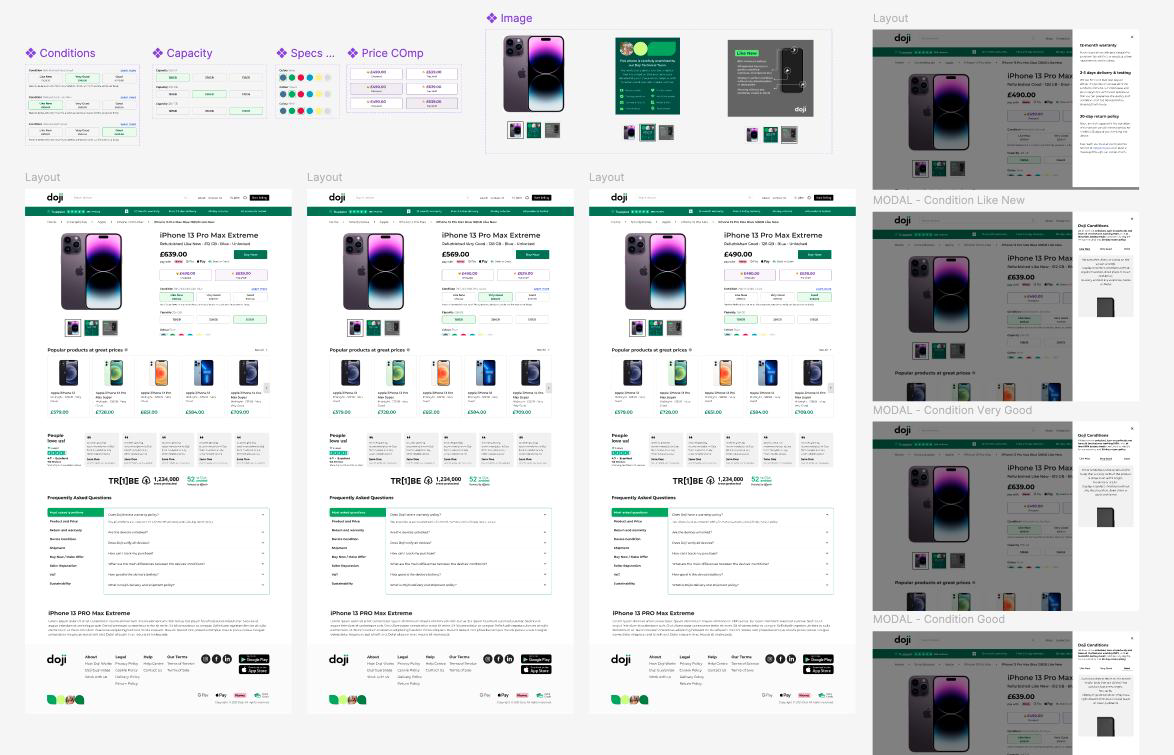
My team ran six rounds of interviews and took the findings to stakeholders. Two changes came directly out of that work: specifications moved from a modal onto the main screen, and product conditions were reduced from five to three — Like New, Very Good, Good.
The modal decision was driven by mobile: users couldn't see the Confirm CTA without scrolling, so instead of confirming they closed the modal and reverted to the previous selection.
Iteration
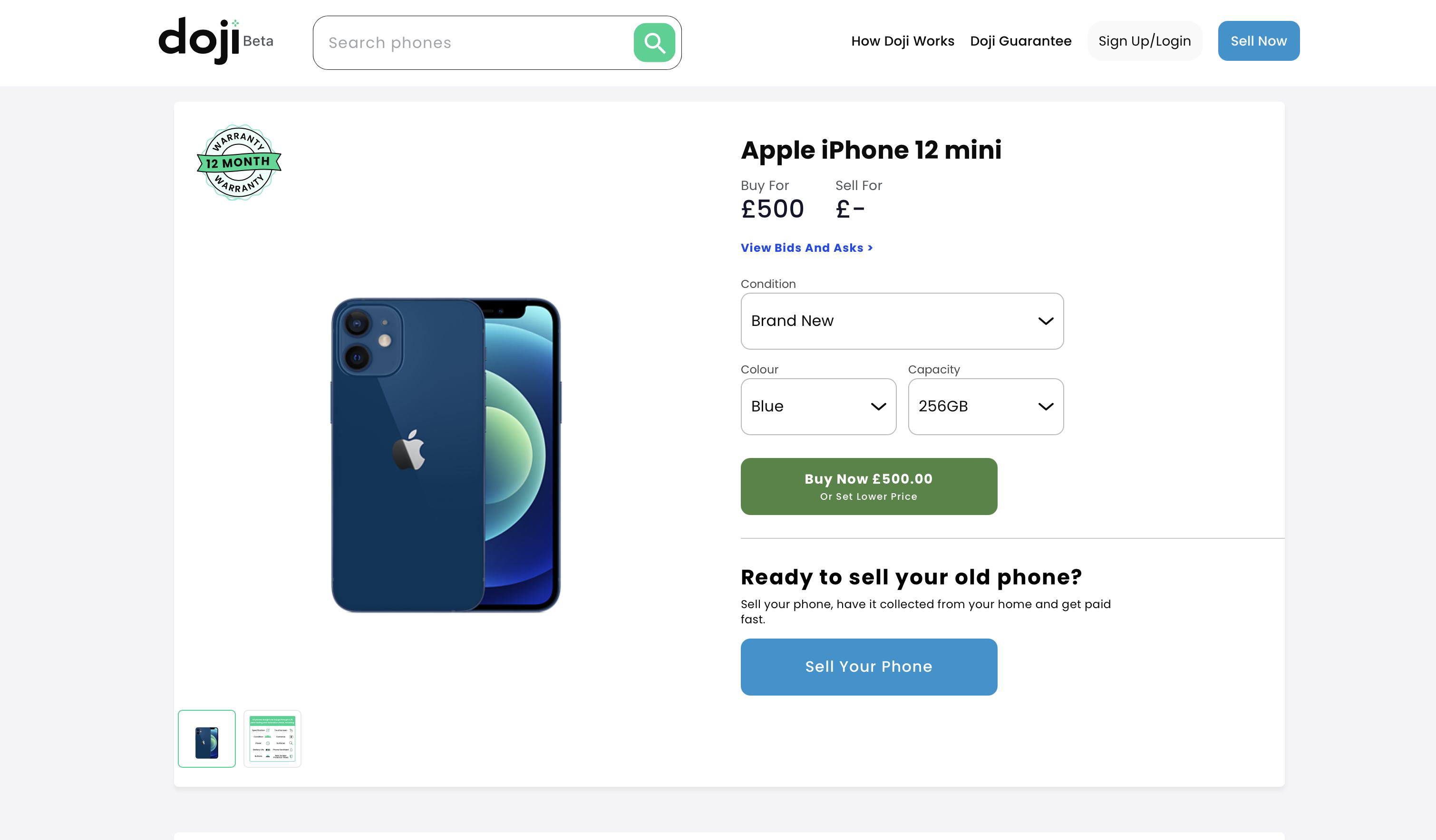
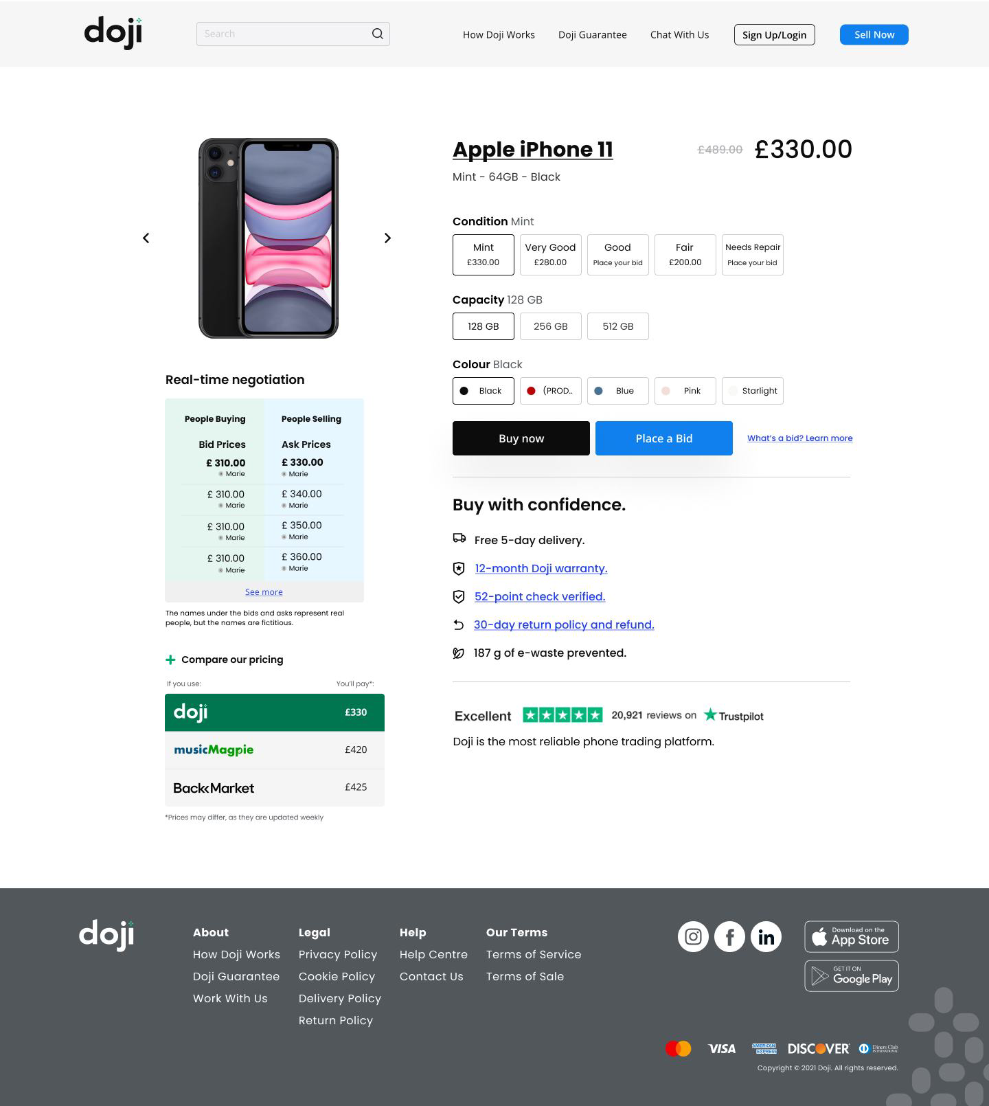
The hierarchy changed as the business learned what buyers actually do.
Early on we wanted to position Doji as a trading platform and pushed users to negotiate by making offers. Later we redefined the hierarchy to prioritise buying now, searching and comparing prices, then making offers. The final version folds in every previous learning plus new scroll behaviour.
To get decisions out of my head and into the team's, I wrote an RFC for each project so stakeholders could comment in one place, and set up a recurring Design & Business review where managers gave feedback on the work in progress.
The product scroll section
Price first, then everything that makes the price believable
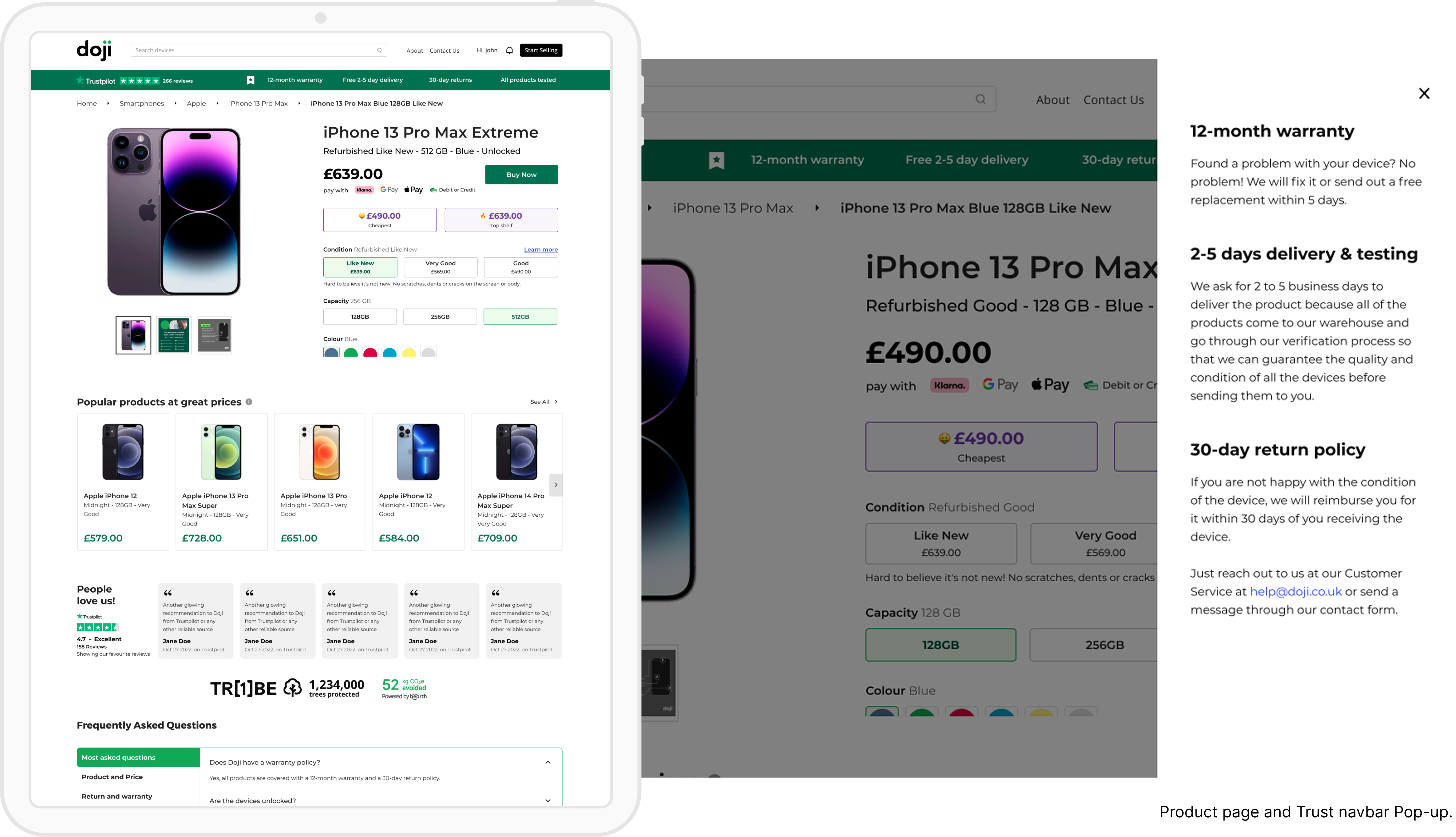
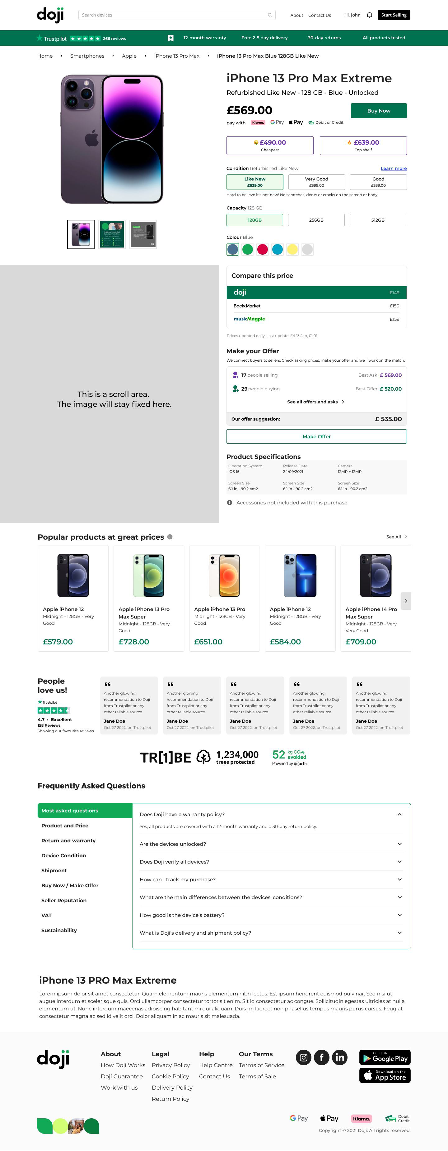
All product information now lives in one lateral scrolling section with platform information below it. The page reads more clearly, and other teams can add components underneath without interfering with the buying UX.
Affordability and trust are connected on Doji, so we put a competitor price table and a trust component — Trustpilot score and supporting information — right where buyers compare. Comparison is the first hurdle in the journey; the page should clear it.
View the prototype ↗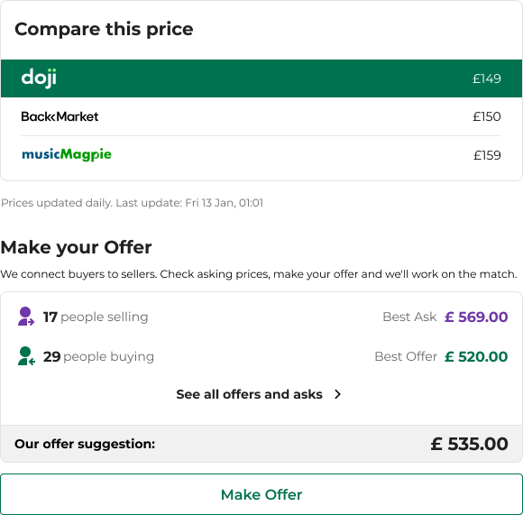
Final layout
The layout below is what we presented to stakeholders, validated in the last round of testing and shipped across web, iOS and Android — price and condition first, product detail in one lateral scroll, comparison and trust below.
Metrics & takeaways
June 2021 to June 2022: conversion rose from 9% to 23.5% — 161% growth.
more users bought a phone with Doji
more users placed an offer via the product page
app downloads over the period
further interview rounds with institutional sellers and buyers
The live site still carries most of the components delivered or tested during this period.
What came after
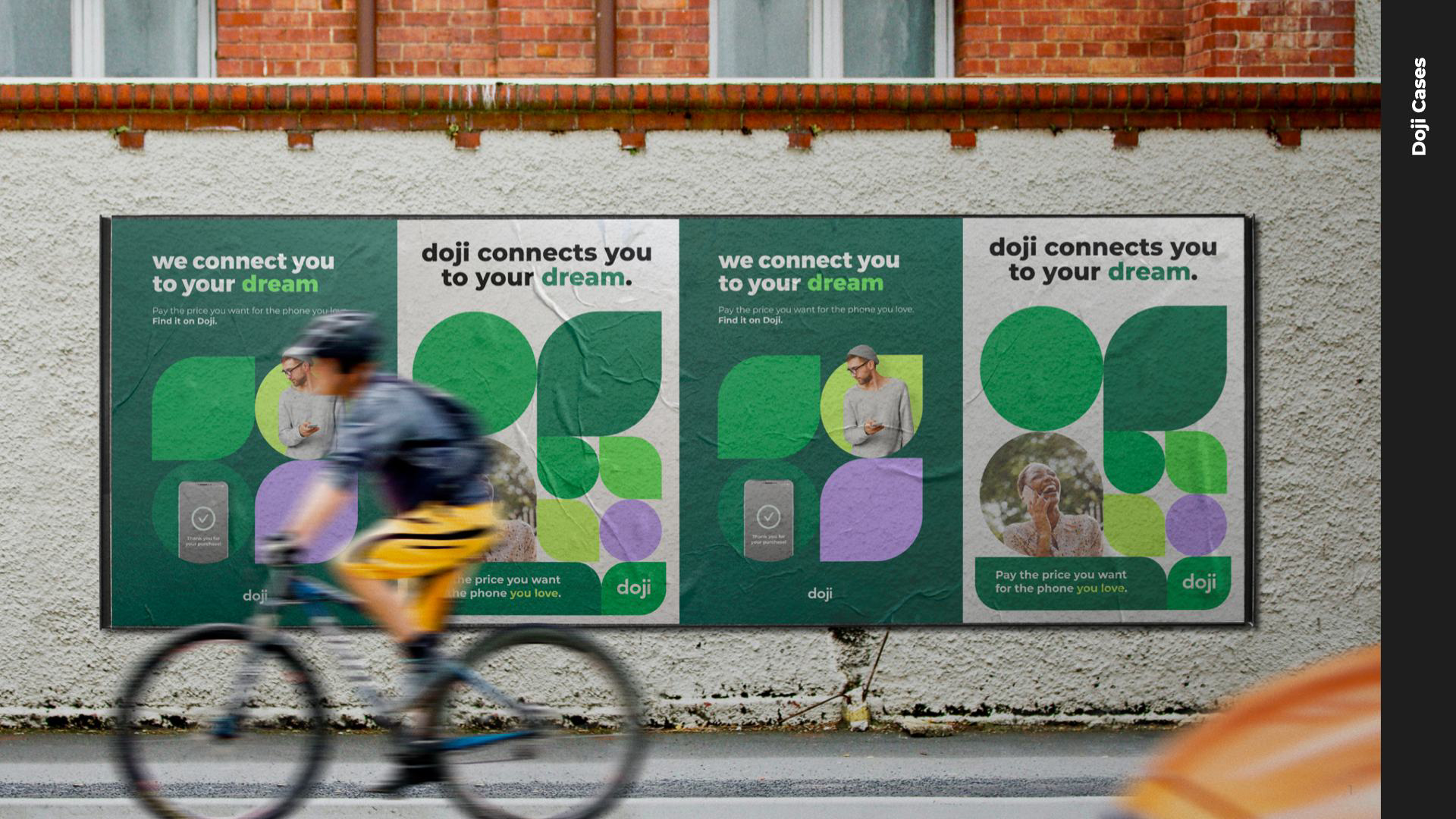
I pushed the research findings out beyond the product page — into the homepage, the About page and marketing campaigns — to bring more human connection to the platform.
To build trust we ran a campaign mixing digital and physical: a real store where people could handle the devices listed on the site.
We kept A/B testing terminology to make the platform more approachable — “I want a discount” and “Wait and save” instead of “Make an offer” — and ran a trade-in project to turn buyers into sellers.