Greenspark — Revamping an impact platform — Cinthia Sokoloski
C Cinthia Sokoloski Product Designer
03Greenspark Shipped

Revamping an impact platform, layout by layout

Greenspark lets companies automate positive environmental impact — trees planted, plastic rescued, CO₂ offset, kelp and bees — triggered by things their business already does: an order, a review, a subscriber, a paid invoice.

I was the only product designer. The work runs the length of that claim: the marketing site that makes the promise, the project pages that have to prove it, and the automations that make the impact arrive without anyone remembering to trigger it.

Role
Sole Product Designer
Scope
Marketing · platform
When
May 2023 — Jun 2025
Platform
Web · tablet · mobile
Reach
300+ companies

01 · The promise

The homepages had grown page by page, with no shared structure.

I began with the homepages: a new structure and a new set of layouts, proposed as options rather than a single answer. I walked the whole team through the proposals and the thinking behind them in one session, collected feedback in the room, and used that round to settle the structure before building anything out.

Getting sign-off on structure first meant the following pages — client landing pages per plan tier, project pages, the API page — were assembly rather than argument.

Page types rebuilt on the new structure
Main landing page Business overview Earth-positive workforce Integrated impact Climate action API
Shared blocks
Impact counters Testimonial set Case-study cards Integration grid Revolution CTA Footer · 11 variants Navbar · 11 variants

02 · Product proof

A promise about the planet has to survive being clicked on.

The marketing site tells a company what their impact could be. The product then has to show them what it actually is — which project, in which country, verified how. That evidence lived in two places at once: a Supported Projects submenu and a separate Public Ledger.

Project Page Personalisation merged both into one Project Portfolio, then went through three rounds to make it worth visiting rather than just correct.

Detail page, three tabs
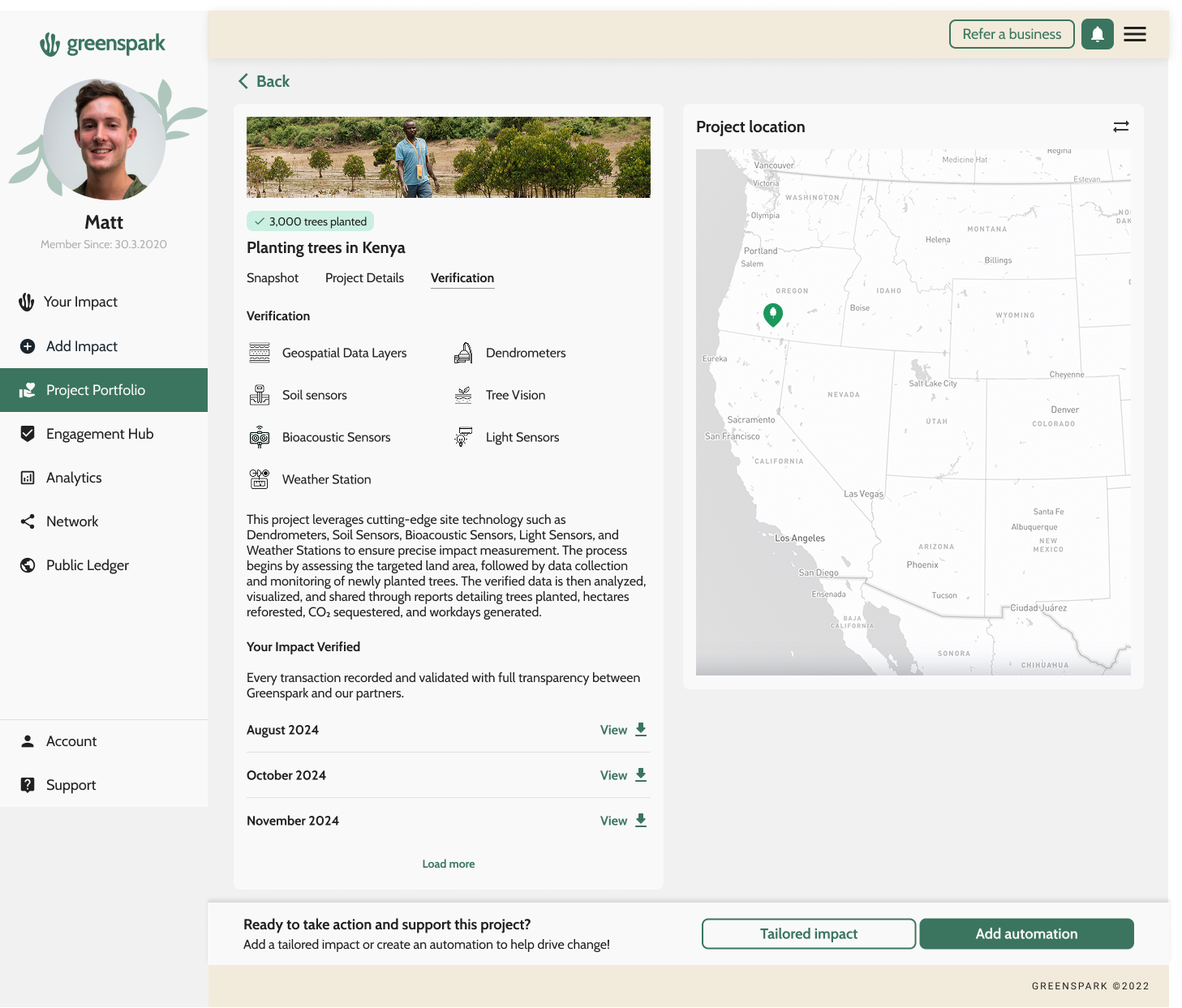
Snapshot — impact to date and equivalencesProject details — species, partner, work days, locationVerification — how we know it happened
Verification layers
Geospatial dataSoil sensorsBioacoustic sensorsWeather stationDendrometersTree visionLight sensors
V1

Merge two menus into one portfolio

Supported Projects and Public Ledger became a single Project Portfolio: filter by impact type, switch between map and list, and open a project on its own page. Sticky components top and bottom kept the next action in reach.

Project PortfolioImpact filtersMap / listSticky actions
V2

Add the fourth tab: photography

Correct wasn’t convincing. A fourth tab brought real photographs of the project — the site, the partner, the work — so the numbers had something to sit next to.

Photos tabPartner imagery
V3

Introduce project stories

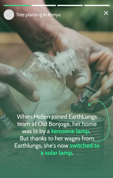
The version that set the direction: story-format narratives about the people behind the work — Hellen at Old Bonjoge swapping a kerosene lamp for a solar one — alongside long-form editorial on what mangrove restoration is and why Kenya’s coast needs it.

Project storiesEditorialHuman proof

Each round answered the same objection differently: V1 made the evidence findable, V2 made it visible, V3 made it matter. Desktop and mobile layouts shipped together, with developer notes on the sticky behaviour.

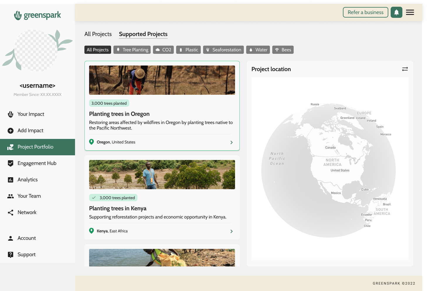
Project Portfolio list — impact-type filters, project cards and the project location map
V1 — the merged portfolio. One nav item, impact-type filters across the top, cards on the left and the location map on the right.
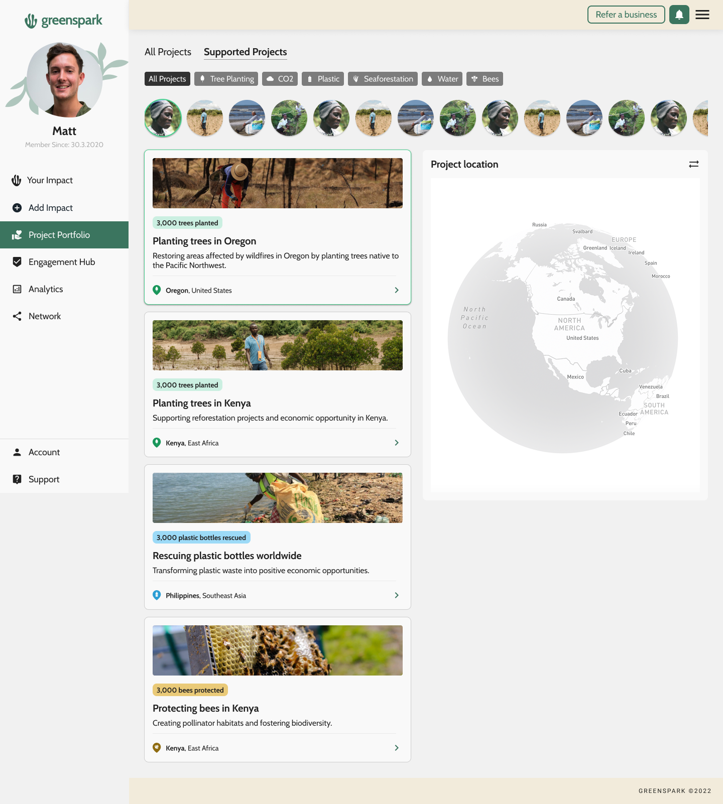
Project Portfolio list with a row of circular project story thumbnails above the cards
V3 — stories on top. A row of circular story thumbnails sits above the same cards, so the human side is the first thing on the page rather than a tab you have to find.
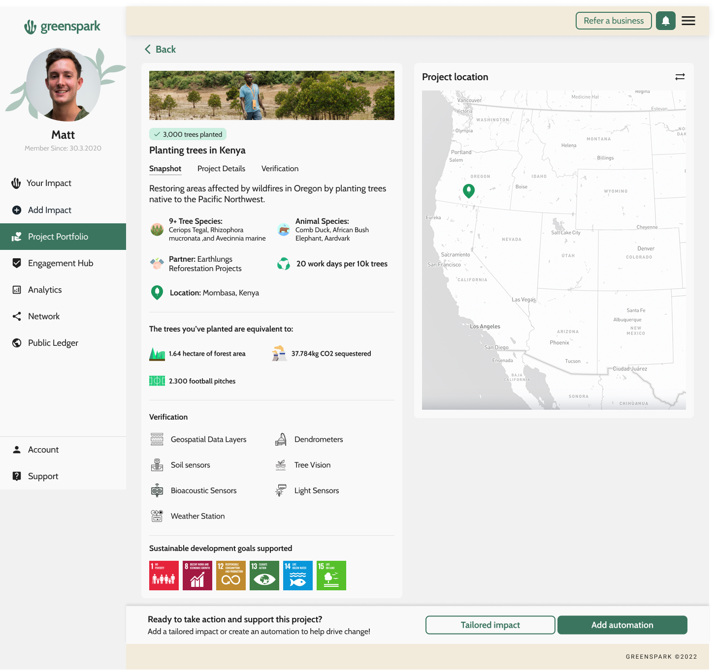
Project detail — Snapshot tab with species, partner, work days, equivalences, verification and SDGs
Snapshot. Impact to date, species, partner, work days, then equivalences — 1.64 hectares, 37,784kg CO₂, 2,300 football pitches.
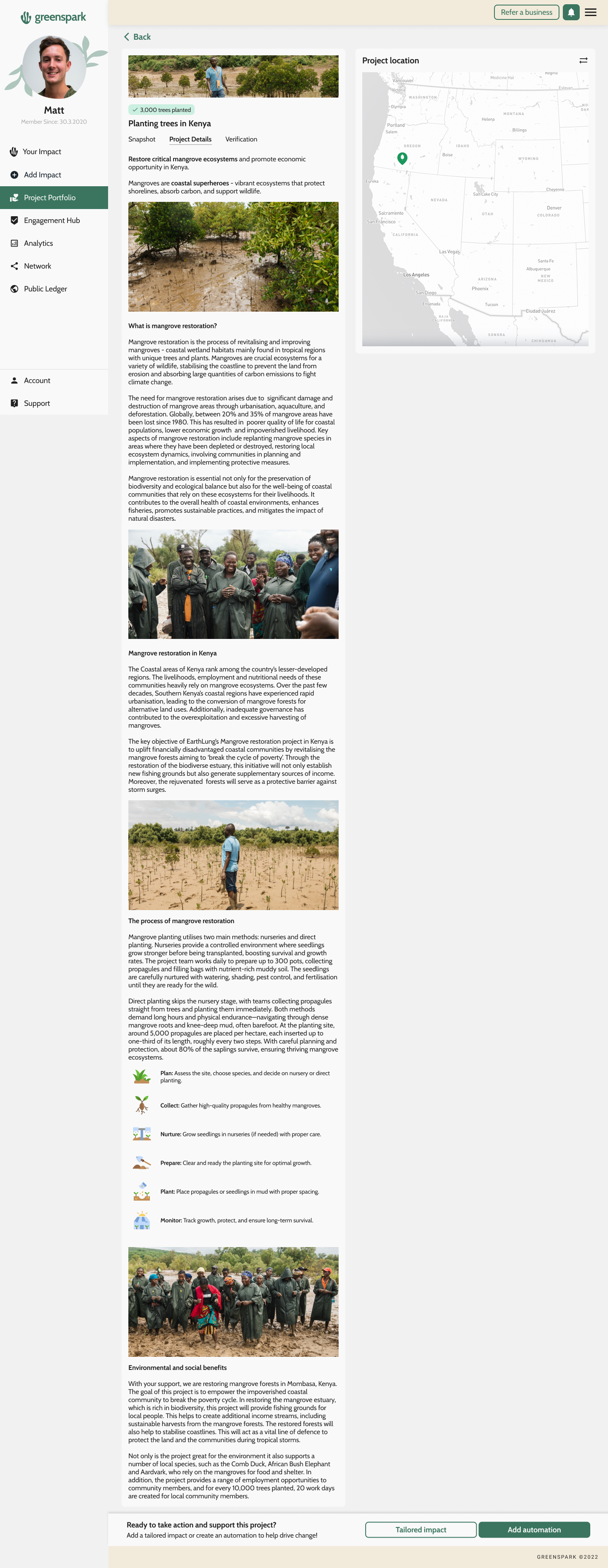
Project detail — Project Details tab with long-form mangrove restoration editorial and process steps
Project details. Long-form editorial: what mangrove restoration is, why Kenya's coast needs it, and the six-step planting process.
Project detail — Verification tab listing sensor types and downloadable monthly ledger entries
Verification. The sensor stack in plain language, then the old Public Ledger itself — monthly records, each one downloadable.

Three tabs, one page, and a sticky bar that keeps Tailored impact and Add automation in reach the whole way down — because the point of proving the impact is to make more of it.

Project story — Hellen at Old Bonjoge, who swapped a kerosene lamp for a solar one

One person, not one number

The stories run in the format people already know from their phone: tap through, progress bars at the top, a photograph and one sentence. Hellen joined the EarthLungs team at Old Bonjoge; her wages meant her home is lit by a solar lamp instead of a kerosene one.

Nothing in that frame is a metric, and it is the most persuasive thing on the page. V1 made the evidence findable, V2 made it visible, V3 made it matter.

Eighty project cards, one family

Every impact type has its own vocabulary — trees, plastic, CO₂, kelp, bees, water, seaforestation — and each partner project brings its own photography, region and unit. Left alone, the cards drifted.

I wrote a style guide per project and per impact type: which imagery, which unit, which colour, which measurement sentence. The card became one base component with a per-impact skin — which is what made a catalogue that size maintainable without a designer on every ticket.

Treesper tree
Plasticper bottle
CO₂per kg
Kelpper kelp
Beesprotected
Waterdays of water

03 · Repeatable impact

Proof is only worth building if the impact keeps arriving on its own.

The platform's value sits in its triggers: impact generated by something the business already measures, without anyone having to remember. I mapped every trigger we could support against the integrations we had — commerce, payments, reviews, email, forms, loyalty — so the catalogue could be reasoned about as a whole rather than shipped a ticket at a time.

Percentage-based triggers needed their own framing: a share of revenue, of order value or of an invoice makes impact scale with the business, which is a different promise from a flat amount per order. I benchmarked how marketing-automation tools introduce this kind of setup and borrowed their step-by-step framing rather than our single long form.

Ecommerce
Per order impact% of total revenue
Stripe
Per invoice% of invoice valueSpend thresholdTiered spend level
Payments · Square
Per order impact% of total revenue
Review
Impact per product reviewImpact per company review
Email
Impact per email subscriber
Form
Per completed formPer selected answer
Loyalty
Loyalty points

The catalogue as it stood when I mapped it: every trigger against the integration that fires it. The monetary and percentage ones — percentage of revenue, percentage of order, tiered spend, spend threshold — needed their own explanation, because impact that scales with the business is a different promise from a flat amount per order.
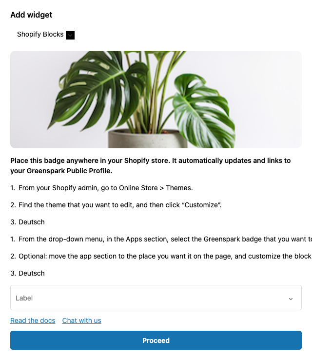
Adding the Greenspark impact badge to a Shopify store, with install steps in the panel

The install is part of the trigger

A trigger is only automatic once it is wired into the shop. The badge install lives in the same flow as the automation it belongs to — platform picker, steps in plain language, docs and support one click away rather than in a help centre.

That closes the loop the case started with: the promise on the marketing site, the proof on the project page, and the badge in the shop that shows a customer both without the company doing anything again.

The decision

Turn one long form into a step-by-step flow

Setting up an automation was a single scrolling page, and the failures all came from that. Back returned users to a blank state on the previous page. Nothing showed why they couldn't move forward. If they scrolled past the name field and tried to pick a trigger, the validation error rendered somewhere off-screen with no scroll back to it. Success and error states didn't behave the same way twice.

The rebuild made the flow explicit: named steps, state preserved on back, validation shown where the user is looking, and one consistent pair of success and error states. On tablet the integration list scrolled horizontally with no affordance — users couldn't find where to edit or delete an integration at all — so that got a visible control instead of a hidden gesture.

Before
One long pageScrollSilent blockBack = blank
After
NameIntegrationTriggerImpact & amountReview
Shipped in three releases
R1 core triggers · R2 percentage & payment triggers · R3 per-product selection

04 · The opportunity

Our best customers got exactly what they came for, and then left.

A new customer arrives already knowing what they want: I have a Shopify store and I want to plant a tree for every order. They go to the Shopify integration, create a per-order automation, and leave — because they achieved the thing they came to do.

The catalogue above was full of automations that customer would have wanted. They just never found out those automations existed. This is the proposal I wrote for that gap — assumptions first, so the team could argue with the reasoning rather than the screens.

Step 1

The user already knows what they want to do — “I have a Shopify account and store, I want to plant a tree for every order.”

Step 2

They go to the Shopify integration and create a “per order” automation to plant a tree for every order.

Step 3

They leave Greenspark, having achieved exactly what they came for.

The problem

Users don't know they could also create a reviews automation — “boost your review rate” — or any of the other sixteen.

The bet

If we surface the most popular and most suitable automations inside the flow they are already in, they will set up one or more extra automations rather than closing the tab.

Suggested automations shown against the integrations a customer already has connected — popularity as the first sort, suitability as the second.

Where it could go next

A guided decision tree

An informational — or AI-assisted — tree that walks a user through what the best automations are for a business like theirs, so the suggestion is personalised rather than a popularity list.

Discovery across the platform

The same guidance placed at the other points a new user passes through, so the possibilities keep surfacing after onboarding rather than only once.

Backlog proposalUser flowsPersonalisationActivation

What I'd carry forward

Settling structure with the whole team in one session, before any polished layout existed, is the cheapest hour in the project. Everything after it was faster.

As the only designer, the leverage wasn't in screens — it was in the base components and the per-impact style guide that let engineers ship the eightieth project page without me.

And the flow failures were almost all state failures: back, validation, success, error. Naming the steps fixed more than restyling ever would have.

← Previous caseDoji Next case →Ekorn